Showing posts with label Comic Strips. Show all posts

Tuesday, August 26, 2025

Harvey Eisenberg's Mickey And The Beanstalk


I'm not a comic geek but I do consider myself discovering comics especially older ones from time to time. It's kinda fun if they make sense, and has some sense of humor.


This is Harvey Eisenberg's Mickey and The Beanstalk comic from 1947, released the same year as the short film. I found Eisenberg's work to be appealing and he's extremely talented. These comics are easily captivating and I find the lettering and narration to be incredible.


Right away, the introduction scene takes place in Happy Valley. I'm learning alot about this particular location. I'm loving the narrator so far. There's alot more character development and conceptual modifications than I imagined. 


I love the narrator pointing out how we didn't expect Donald controlling his temper, since that's what he's most known for in terms of his actions. 


Next we meet The Golden Harp, I honestly felt like she could've had way more potential, because I really like her concept, but she kinda acted like a normal person, which is fine but I just wasn't too big on her scenes. Alot of unique colors in this page. The mysterious shadow has a good shade of purple and light blues.


This was that one scene I remember watching from the short film I admired the best. It was one of those first experiences I had on liking old-school Disney. In the original Fun and Fancy Free movie, the Happy Valley looked dry and depressing. I could mention that this strip uses a natural and joyous blue background, but to me it doesn't work. Still solid though on the other bits, including that one sign near the cow, that's good detail and slice of comedy.


We almost get the same type of reactions from the movie version, except Donald isn't shouting angrily at Edgar Bergen as he breaks the 4th wall. 


I also loved alot of the camera angles and emotion in that film. The part where Goofy and Donald look immensely at Mickey slicing a bean and they look like their sweating is just masterful. I would like to know who animated that entire 2 minute or so scene. 


I can freely thank Hans Perk for the excellent drafts. Very useful! 


Anyways back to the comic.


Donald apologizing to his friends will never not be entertaining to me. It's also now canon the cow has an actual name. 


I absolutely love the interactions of all three of these characters. Mickey, Donald and Goofy together was always one of the best that old Disney had to offer. They inspired my characters, Dredd The Moose, Szac and Phillips Bear. 


We still get some excellent drawings and reactions. 


This is what I like about comics, they're not pushing boundaries like trying to only make people laugh or get invested in only pictures. 

The last scene of this image reminds me of the Three Stooges when they sleep. 


Now obviously alot of the Disney books especially the Little Golden ones try to tell the premise like the original movie. I guess it's because these were made when VHS and television weren't releasing/airing these movies yet, and it was better to adapt it in literature. 


Honestly, I might prefer this over the animated version. I remembered watching the Fun and Fancy Free behind-the-scenes documentary exactly a month ago, this was originally going to be a feature film, but was trimmed down to only half an hour. Kinda disappointing, but it's still something. 


The color choice of the green grass is really interesting. I also love how well-drawn the flowers are. It's not easy drawing flowers at all, you have to really see one in order to make it look real.


I like the design of the frog, we get more natural color schemes. Also the 5th panel below where they show Mickey Donald and Goofy as silhouettes is great. 


So much action in this singular page. I chuckled when Donald said "Ya big sissy!" I could imagine almost all the actors who voiced these timeless characters doing these lines. 


I have no idea if I might make a 2 parter of this, it's just a preview of the entire comic. I wasn't originally planning on making this without Michael Sporn's "splog". Once again thanks to him. I'm learning alot from his website feel free to check it out. 

Here's the link to the comics.


Wednesday, April 2, 2025

Natural Artists - Swinnerton and Rabier's Style Of Success


I was looking into a Silly Symphony cartoon recently called Elmer Elephant (1936) It's a really cute and well-told cartoon, but I seem to love alot of the designs the most.


They remind me of a certain artist I've been admiring lately. He seems to fit my drawing style really well. This kinda relates to James Swinnerton especially in his Near To Nature Babies illustrations.


Swinnerton is a truly magnificent and influential artist. He's made a ton of cute and relaxing paintings and characters throughout the 20th century. These were specifically made in the late 20s and they still look refreshing and beautiful a near hundred years later.


He had alot of passion with animals because I can't really tell what their actual species are. They just seem really interesting and unique to look at.


I love when cartoonists draw something quite appealing to viewers because it actually helps to be inspired or enjoyed by something your actually seeing.


He has a great sense of modeling with these type of characters. Disney and other studios must've easily been inspired by these drawings, and not only McCay and Herriman's drawings. 


Like I was saying about Disney's Elmer Elephant, it uses alot of animals and has these cute and natural designs you rarely get to see in cartoons. Their anthropomorphic and wear clothes humans wear. 


He was truly iconic and my favorite cartoonists. 


I recently tried drawing some of Swinnerton's characters and giving off a Ward Kimball charm to them, the flappy shoes, the round heads. Kimball is among those animators I genuinely feel inspired.


Kimball's animation especially in the early 40s were one of Disney's best. There was something unique about his animation style that was different to the others. The character's lip syncing was really unique and freshly drawn. His movements felt cartoony and witty as well. It really catched me and it was kinda easy for me to imitate it.


Today I was exploring more comic artists and the one that stood out to me the most from what I saw was Benjamin Rabier, a french artist who rarely gets the treatment nowadays. Just look at his info.


I realized that this legendary man was really iconic and drawn to me as well. I do have to say his early starts weren't as great as what came later his comics like this one were kinda boring and uninteresting.


To me his illustrations were by far better and more appealing. Look at how gorgeous this illustration is! This is easily impeccable and worth appreciating.


I literally knew about this guy at first glance recently and loving him already. I rarely get to talk about people from other states but it's quite amusing for me to talk about them. 


I've been trying to freely explore almost every old illustrated artist I see on the internet and while yes, almost all of them I looked at have fairly well drawn images, I can't say they all left an impact on me. Some of them have messy color prints on the strips or have the most hard to look at characters in all of comic publishing history. It's no surprise that these actually have potential and while they are rare and quite lost in terms of newspaper issuing, these are still timeless and worth the recommendation.


You can really tell that all Rabier wanted to do was make something simple yet engaged, no story, no words just art that speaks for itself. 


It's kinda rare seeing artists back in the 20th century go on for a more cute aspect since every cartoonist was wanting the viewers to take on a more serious approach to art, which is amazing but you can't say no to appealing character designs like these. 


Likewise, it's fair to give a small amount of necessary and straightforward images like this one to keep you invested.


You may want to know what this means, just by looking at what's selling or what's advertising, but I have no idea either. That's not what artists like Rabier are telling you. They are simply crafted and proud people and want to put everything on stuff for shear fun.


The color choices are also original and pleasing. The outlines are really well constructed and professionally drawn. Art was basically at it's golden age since people didn't know what to except out there whether it was something hilariously silly like Looney Tunes or Tom and Jerry or a fancy fashioned magazine cover that'll keep you amused every week, the 20th century was full of creativity and unexpected reality.


Both Swinnerton and Rabier are artists that have amazing and fascinating details to one of their drawings that makes it more of an adventure rather than remaining it's political state which is what people seem to like nowadays. 

It's a good collection and if you wanna experience more 20th century madness, then check out what I have to say about J.C Leyendecker and Winsor McCay and more on James Swinnerton.


It won't take you too long to find out about them on my blog. So stay tuned because tomorrow I'll be on another journey to exploring more artists and gems from the past. 


Sunday, February 23, 2025

My 2 New Favorite People


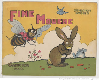
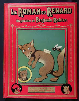
I'm always on the go looking for new things to explore especially in terms of art. So I explored two new names I recently kept tracked of. 

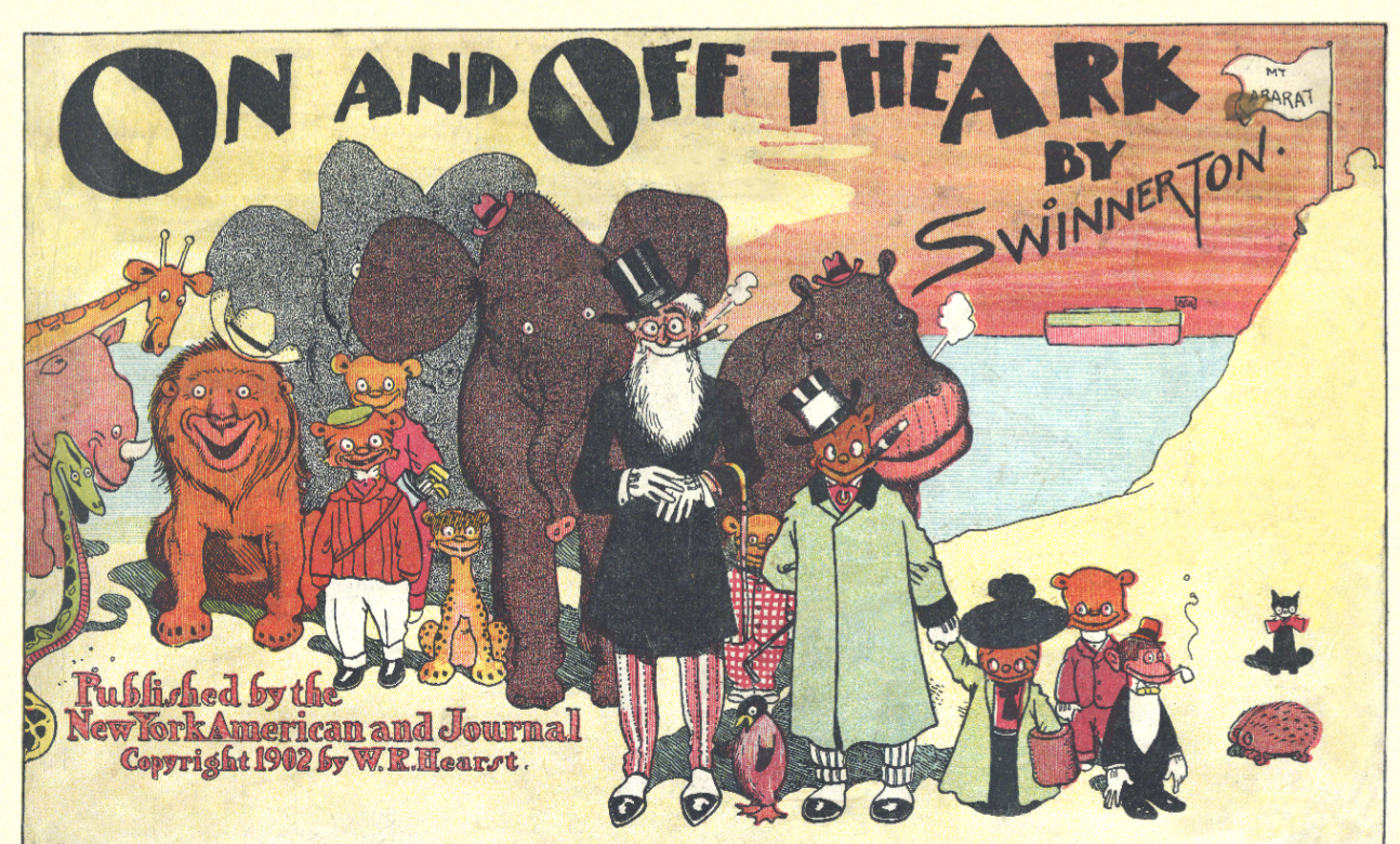
First is James Swinnerton.


I've seen this drawing before, I just had no idea who actually made it until now. He's really good at painting landscapes as well, but I'm really here to focus rather on his characters and comics. 


I admire alot of his character designs. It's probably the cutest thing I ever seen in my life. 


I find cute to be better than unappealing and creepy because it can really warm your heart in the best possible ways. 


Apparently there was a Canyon Kiddies cartoon Chuck Jones made at Warner Bros. These illustrations are much better in my opinion.


James Swinnerton was overlooked and forgotten in the worst ways possible. SERIOUSLY! This person is an absolute legend. Look at these memorable designs. 

The simple circled heads, I adore it. 


Not every character in this picture have a strong personality, but all of them have such a unique and stylish design. 


These backgrounds here are what I'm striving for when I'm making my own cartoons. They all don't have to look like Disney quality, but these colors, my goodness, these colors are absolutely gorgeous. 


Mr. Jack is probably my favorite series of comics recently. 


These were made around the 1900s-1920s. Everyone back then looked handsome and attractive, more than I thought at first glance. 

The sizes of the entire strip are more gigantic than most daily comic strips today where everything is squished in and not all that fun to look at. 


With everything going on in the world right now, there is still a chance to make something as beautiful and simple as James Swinnerton's art like here with the black leopard. It may not be as levels as something like The Star Wars franchise or Marvel, but it's still easy for you to get into something if your time feels wasted.


Even for something as cute and refreshing as the old stuff.


I have other comic artists I love and care for.


George Herriman's Krazy Kat comics are simple yet sketchy and joyous. All of the main characters have an amusing personality.


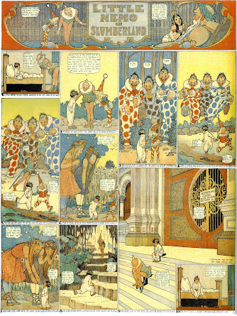
Winsor McCay's comics have such an interesting yet full of spirit to them. I may like his films better, but you can't beat these in terms of how imaginative these ideas can be. 


Normally I don't go too into depth with these artists because some of their work can be too jumbled, but in terms of style and perspective, these artists are influential for numerous of reasons. It's probably because for the most occasions, they work hard and put in the most detail than any other illustrator out there.


Take something popular besides comics and sue, and add a favorite cartoon like Looney Tunes. Sure, not every cartoon was good in their repertoire but you can constantly remember and love most of the main characters like Bugs, Daffy, and Porky Pig for specific reasons. Each of them having marvelous and lively personalities, straightforward but down-to-earth played scenarios and action-packed scenes that you'll never see done in real life. I was so floored when I first saw these cartoons at 13, and knew they were the biggest inspiration for many artists like me to come.


I already talked about what my animation appeal fits best, and my 2nd best option was Classic Disney mostly the ones in the 30s to 40s. 

There will never be another animated scene like the Brer Fox scenes in Song Of The South ever again. Which is why they're one of my favorites. 


I have the references talked here.

https://sngexplorationblog.blogspot.com/2025/02/my-animation-appeal-part-2.html?m=1


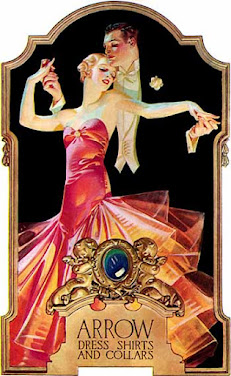
Now let's take a look at J.C Leyendecker, because this guy rules.


Leyendecker has to be the most observant artists in the early 20th century. He visioned so much on the planet Earth, he packed all of the good elements into one, like fashion, humans, and colors.


This is a good example on how society was back in the past. It's not pushing onto conservative efforts like politics and war and just goes straight into a normal day in people's own lives.


Half of your time daily is following your heart doing what you want to do. This really shows something when this picture here was made back in 1933, it has alot of warm and cheerful colors like those dots.


Just like with Swinnerton's drawings, Leyendecker's cute style is really sweet and appealing. I love the red, black color palette to this one, it was at a time where not every color you used was exceptional.


The best type of paintings I love from J.C is when he adds the additional black backgrounds making it more classy and cinematic.


These are all modest and fancy. It's more appropriate to me than any other field of art nowadays. Classics relatively had more novelty and more creative aspects making for a more juicy and sharp product. 


Friday Out On The Farm

  Today was an interesting day, I went out and went to a farm, shopping and got pumpkins. I was drawing concepts of an actual mascot to the ...