We had times where in part of our childhoods or just upon our nostalgia, we had a vibe we were going with at the time.
I'm a Gen Z-er. My parents had loads of stuff like this similar to the Gameboy advance game you see here. You feelin' old yet?
Now I never played any of these games. I chose these because they fit my childhood really well. The colors are all moderate. Not too dark or too bright.
I used to have a lava lamp in my room when I was little, it was orange yellowish colors and I would sometimes look at the sunset. This painting summarizes everything I said.
This is precious. Painting is called River At Ascutney made by Maxfield Parrish, 1942.
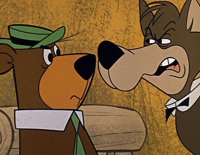
While I discovered some shots of the early Hanna Barbera episodes, I immediately was drawn to them. There's something about that simple charm to these that needs to rise back.
The solid dark yellow is really gorgeous. The natural colors to Yogi and the wolf fit the mood.
A few weeks ago I mentioned The Rescuers scenes involving Oliver, Bernard and Bianca flying and the yellow reminds me of the color palette they used in the classic Yogi Bear episodes.
It also reminds me of the original 1941 Curious George drawings.
While I really like natural colors, I do like a little bit of pinks, purples and blues here and there.
These hit differently than the other color palettes. It gives off more personality and vibrancy to the whole thing.
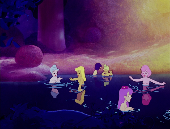
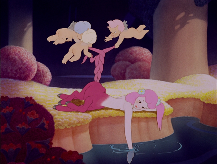
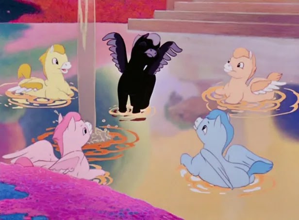
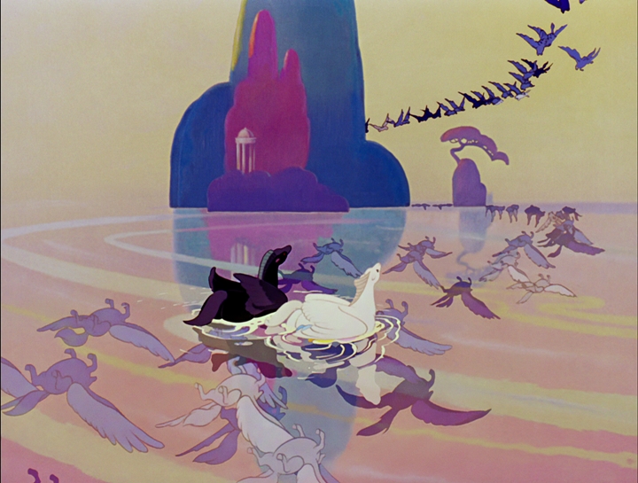
Fantasia has alot of great segments like The Sorcerer's Apprentice and The Rite Of Spring. I adore the colors to the Pastoral Symphony the best. Look at the pinks, and magentas.
Like I was saying most of these colors feel like their too colorful and in your face. At least with so much colors there are in this scene, it's necessary. That's the problem with most of the content you see today. This pitches the right amount of brightness effect.
The neon colors never truly interest me that much. I know some people out there like it but here's a way I could edit it out for all of you.
ORIGINAL
Now I'll go deeper into films I actually find pleasent that fit my nostalgic vision very well.
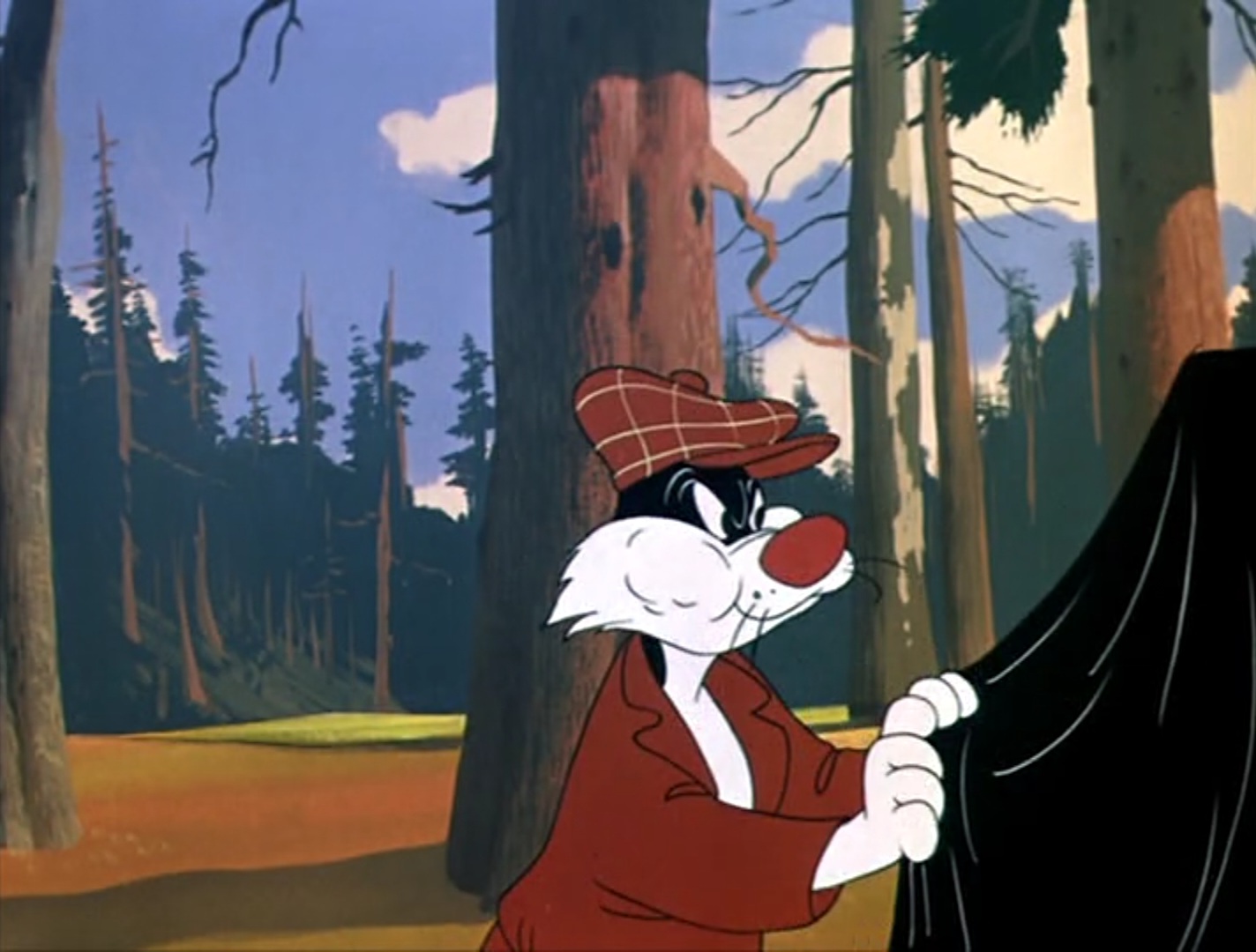
I always thought the best thing about the Sylvester and Tweety cartoons were the backgrounds. Especially in the early 50s. Tweety's S.O.S has some massive backgrounds. In my personal opinion, when Friz was making too much Sylvester and Tweety's the more shorts he made the less interesting the backgrounds looked.
My favorite besides Tweety's S.O.S is Tweet Tweet Tweety (1951). Not only does this have sweet and outgoing scenery to the whole thing but Carl Stalling's music is perfect especially with the scene involving people taking pictures of Tweety.
The early 50s was always a good year for Looney Tunes and it's beautiful scenery. I wonder who did all of these.
Absolutely beautiful. Makes these cartoons a little bit better.
When I was little I always liked Disney stuff even though the movies barely aired on my usual channels. I liked Disney Jr. though and had a bunch of toys. I even had Winnie The Pooh books that I still remember with all my heart.
I lost my love for Disney when I was beginning to be a bigger kid but then I loved it again because it represents wholesomeness, joy, and creativity.
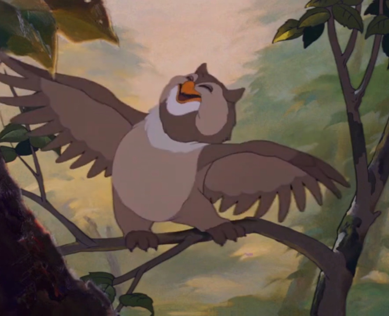
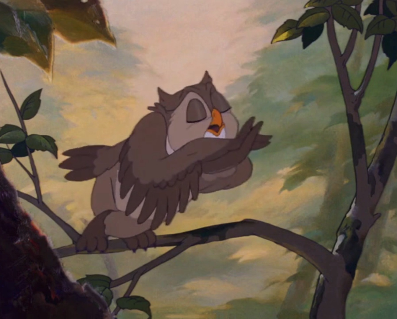
Bambi is the most ambitious Disney movie I ever seen. I admire alot of the characters including the owl. He's hilarious, his movements and acting is marvelous and where he's living in seems so peaceful and laid-back.
Just like with Bambi, I have alot to say about Peter Pan. It's a really cute movie with an amusing story and memorable characters. One of the scenes I like are the forest scenes. The color palette to this is just BEAUTIFUL.
The trees, the green grass everything about this is really appealing.
Audiences would mostly get distracted by the characters the most in the film, and I agree. But that's because I had to focus on what was happening. Usually at second viewing, I can examine more of the details.
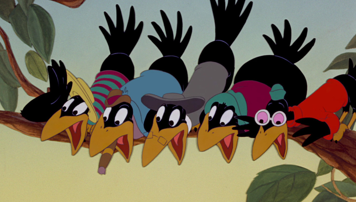
My favorite colors to Dumbo are the scenes involving the crows. The blue yellowish skies are amazing. I also love the olive colored grass. It's simple without being too sensitive. The crows themselves are natural and witty characters and they fit really well with this atmosphere.
Every color is brashing with personality. I really miss when cartoon characters let loose, dance and sing, it just feels right for cinema to do that.
Lady And The Tramp has to be my least favorite Disney film, but it's not bad in the slightest. I just find most of it nonsensical and boring, but not the visuals. I still like alot of the backgrounds and interactions with the two main leads.
This movie barely had any breaks so when they do that, it's truly one of the better scenes in the movie. Tramp stares at Lady sleeping with a cute smile.
Here's a great opening shot of Jiminy Cricket laying on a lily pad in Fun and Fancy Free (1947), really underrated movie.
I could imagine what people could do with their own art if it was inspired by their more simpler time experiences.


