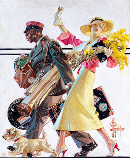
Showing posts with label J.C Leyendecker. Show all posts

Friday, January 16, 2026

Rich Natural Colors In Pulp Art & Films


Sometimes my style of art changes. As of now I seem to enjoy muted yet pleasing color schemes and pulp art!


I like these neutral colors. This was painted by Andrew Loomis. 


Smart color styling altogether. I used 4 colors that fit the image very well. Reds, blacks, beige.


Here's another incredible one by Perry Peterson. 


Again, I love the beige, it's not too lame like today's fashion standards apparently.


There's great color from a movie I watched recently called Rear Window (1954). I absolutely loved it. I seen a few images on FILMGRAB that were my favorite scenery in the entire film. Those clouds are gorgeous. 


Obviously this film is directed by Alfred Hitchcock, and he's known for having the best cinematography and visual effects I ever seen. He was amazing and it reminds me of his other movies with the city vibe like Rope (1948).


Also in addition, here's this cool movie poster with a limited color palette of course.


As for another Hitchcock film, The Birds (1963) also has some astounding background shots. I also watched the movie, but it was on a much different ratio. I still really like this screencap, this by far has the best colors I seen in just one movie image. So pleasing!


I have some more vintage "pulp art" I downloaded.


Another great painting by Andrew Loomis. I have talked about him before on my blog if you want to click the link. 


This one I know the name of and is painted by Austin Briggs "Flight Into Darkness". Those yellows are nostalgic to me. It's weird to say but it reminds me of lava lamps.


Now how about more fictional characters and settings? I love me some Juanjo Guarnido artwork. His art is what I want to create myself. Just anthropomorphic animals acting out as live-action humans in serious territory. This is one of my favorites from him. It gives off movie model vibes. I adore this.


Most animated cartoons I talked about on this blog already have some great color styling. But I haven't talked about What's Brewin Bruin? (1948) yet. It's one of my favorite of the Three Bears cartoons. They're funny and I always loved them ever since I first experienced them. 


This alongside The Bee Deviled Bruin has some great backgrounds of the rocks. Peter Alvarado is credited for the background art. 


And finally for now is J.C Leyendecker, I don't think I praised him enough for his early artwork. This one's from 1906! Almost a century and 2 decades ago! Great stuff. 

Friday, October 10, 2025

Great Vintage Stuff 2


I was a little proud for making the first post last month, so here's a sequel. Enjoy these pictures, they represent warmth and passion also a little inspiration. 


Here's a rare Japanese theatre release poster of Guys and Dolls (1955) this is so unusual but pleasurable. I kinda like the abstract dot patterns. 


Here's some outstanding Song of The South artwork from record covers. 


I miss this era of Disney. Imagine if Walt Disney Records would've continued making records in a style like this with their Renaissance and modern movies. Unfortunately that died out, but I do believe that Disney is still trying at least when it comes to their animation studio.


I'm a fan of the old Collier's magazines, particularly the ones illustrated by Vernon Grant, but here's one of my favorites so far designed by Wilson Cutler. Love the woman's facial expression.


Now here's some fun stuff. A Disneyland coloring book from 1955. This is too good! I could look at this all day, don't entirely know who designed it, but they sure know how to impress viewers.


J.C Leyendecker still continues to be one of my all-time favorite artists. His art is just so fresh and creative. I also admire the casual fashion, they don't directly advise stuff like this anymore. 


To me, it just isn't the same. The magic is quite gone. The magazines I'm seeing are actual real photographs, it's fine but not exactly what I prefer to invest.


Richard Scarry's Golden Book era is my favorite, his design of Smokey The Bear is literally the cutest I ever seen. I discussed about his other art before in previous posts click this link if you have the chance. 


I have alot to say about this. I love the color scheme, just like with the Disneyland cover, I appreciate the coloring books where the cover art has a train, they are really difficult to draw, this is very cute. Illustrated by Pete Hawley, he's probably a new favorite of mine.


Finally, I bring you some autumn art, this is a 1946 The New Yorker magazine cover that I really like. The color scheme is perfection, it's naturally accurate to the actual palettes to the fall season. Those trees remind me of the backgrounds from Disney's Legend Of Sleepy Hollow. 


Part 1

https://sngexplorationblog.blogspot.com/2025/09/great-vintage-stuff.html?m=1

Thursday, March 13, 2025

Early 20th Century Fun 2


A few hours after I did the Early 20th Century Fun post, I was instantly saving alot more pictures.


Enjoy!


 More of that Leyendecker goodness!


These are great poses!


Just a heads up. I realized J.C Leyendecker wasn't the only one who made all these paintings you see here. His brother Frank X Leyendecker worked on some of these too.

Really interesting if you ask me.


Another amazing artist, Paul Stahr.


So is W.T Benda.


Hope you enjoyed the ride on this little journey. 


Re-Telling Blue Cat Blues from Tom and Jerry

I made it no secret that this is easily my least favorite of the Tom and Jerry cartoons period, yes I consider this worse than the clip-show...