
When it comes to cartoon characters, most prominently, popular characters, Mickey Mouse is definitely the most iconic.

Not only did Mickey successfully impacted future generations but he also had a bunch of design changes over the decades of his creation.
I want to start at his first design and end to the more current one we have today. This is my own personal opinion on each of his designs.

This is one of his earliest sketches ever put into paper. I really like it. We're already starting to get personality from it all.

When Mickey Mouse finally got himself a cartoon in 1928, his design was already iconic. This is his most important film, Steamboat Willie. I wouldn't call it the best, but it's still memorable.

The reason why I wasn't fully drawn to this style of Disney cartoons back then was because it felt rather basic in a weird way. This cartoon was directed by both Disney and Iwerks, and just by looking at the design choice, it isn't very expressive.

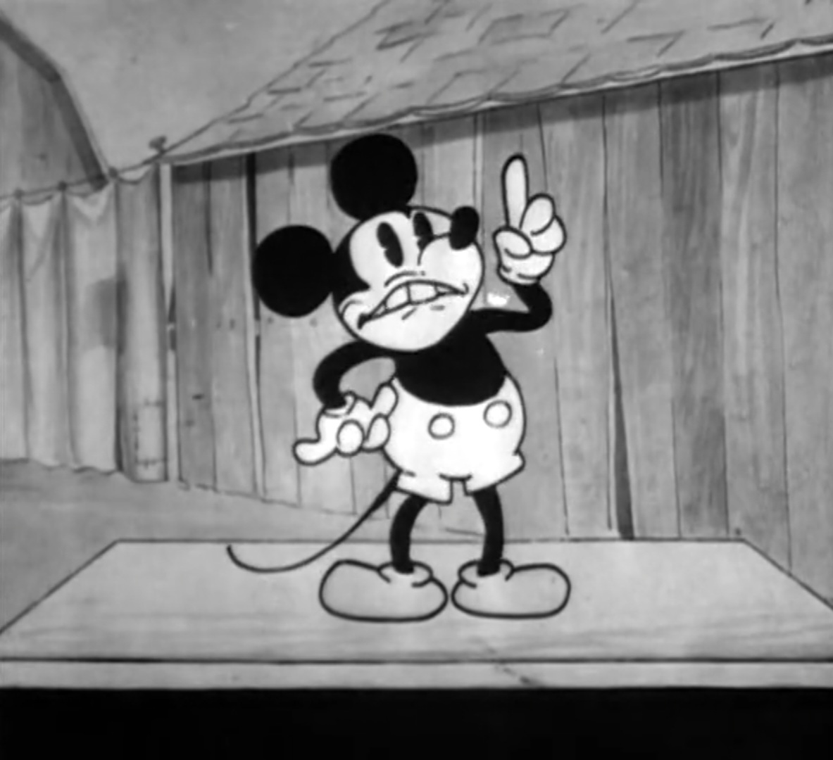
I definitely prefer the bigger eyes in this time period for Mickey.
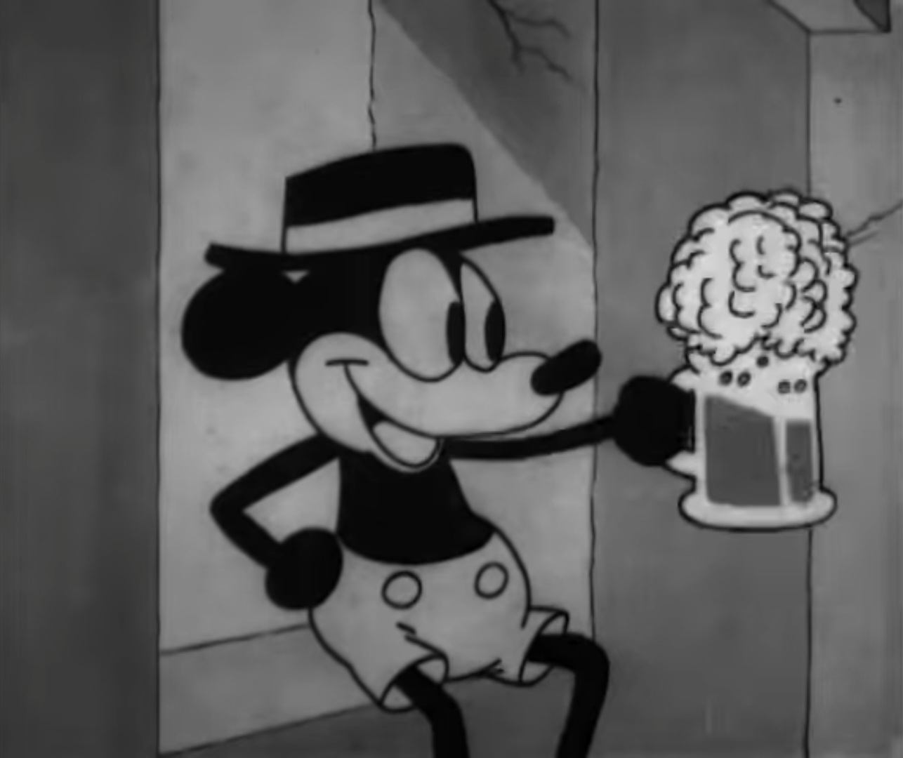
I find cartoons such as Plane Crazy and Gallopin' Gaucho to be more appealing and watchable than Steamboat Willie. I can't help to admire this early start for Mickey looking like this.

This is a stellar expression!
Now we move onto next year.
Alot has actually changed for Mickey's design. He became more of a household to merchandise and popularity. In my opinion, the first stepping for Mickey's career is Mickey's Follies (1929) where Mickey is singing to his girl Minnie and the animation in it is bizarre for it's time.

Not only that but the animators were getting more of a feel of what a cartoon should do in order for the audiences to laugh or enjoy it. I would assume that back then silent short films didn't look the best, but here I really like how well drawn Mickey and Minnie look.

I know when I start to animate films, it might not be the best but I want it to be at least neat in terms of design and characters.

This design of Mickey is really pleasing even though I think it's alright personally. I can see the animators having fun with the character's model sheets, because this is some awesome stuff for it's time.

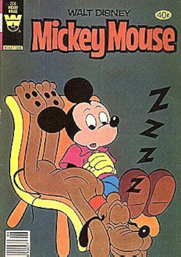
Of course, this character was getting too much praise that he became a success in the 1930s. I would assume that everyone knew what a Disney was at that point. There was toys, lots and LOTS of toys. And they were weird.

Why would anyone want this?

Ummm.. let's just get back to the animated designs.
When Disney released their first color cartoon, Flowers And Trees in 1932, it became a impact on the cartoon industry and became continual throughout the entirety of Disney.
Mickey's first color cartoon was a 2 minute parade march. He wore green shorts. Which really doesn't fit him well. Apparently his green shorts were a thing before this cartoon aired.


When Mickey finally accepted himself in color, he was more expressive. I kinda like it. There's something different about it than the previous designs. He feels more cuter and rubbery.

I definitely feel more drawn to him in technicolor. I watched almost every single cartoon with this design. I think it's because the animators keep on improving or something or the plots to the shorts became more entertaining and less bland.

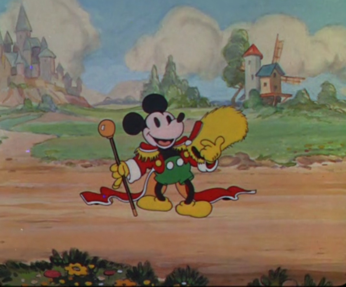
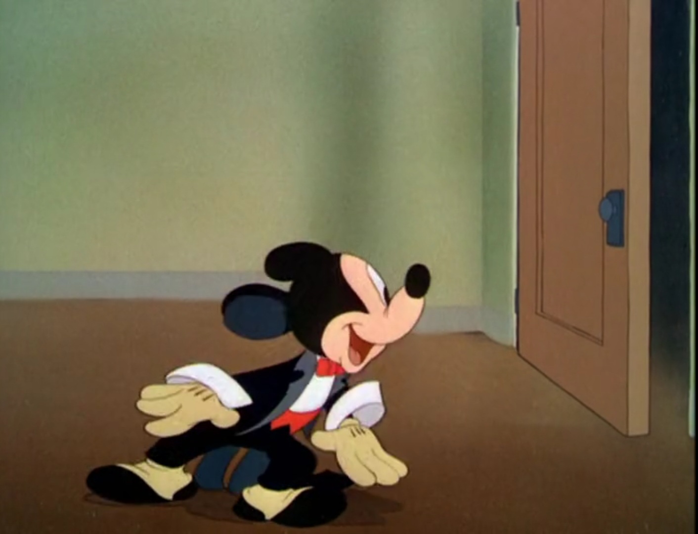
A few years later, Mickey needed another redesign. This time with pupils and a more flesh toned colored face.

It's cute and more kid-friendly. He also has more of a personality on what he's seeing and how he moves since we're heading to the 1940s, animation is becoming more imaginative and intense.

Especially with Fantasia (1940), that film was impeccable for it's animation and character movement. At this moment, this version of Mickey became more likeable.

This is one of my favorite designs of Mickey ever made. These were mostly directed by Riley Thomson, and you can tell that Disney was beginning to become more playful.

I like how Mickey and Minnie have different color tones to their faces.
Mickey was given a more smaller height, he had a more cartoony outlook on expressing himself and his ears became more mouse-like.
I remember hating how Mickey's ears looked. Those simple circles, they were stiff. I just couldn't stand them.

In 1952, Mickey was given a more modern angular design. This is probably the most underrated look for Mickey I've seen. Sure his personality and his cartoons were a downgrade but I really like it.

Even then the 50s, other cartoon characters besides Mickey had more of an angular look.

Mickey's final end to cartoons was in 1953, but that didn't stop there. He was redesigned again. He was not only drawn to people in movie theaters but also television.

They also made the best design of Pete ever. I love this. His design in the classic cartoons were kinda lame though he had good movement and expressions at times.
When it came to the 60s-80s, Mickey Mouse wasn't that loved anymore. Yes, he was still iconic and still was the king of merchandising, but there wasn't a gain to him being that expressive anymore.

Until, in the mid to late 90s, Mickey was starting to become an impact again in the world of animation.
The world of TV, back in the 90s-2000s was wild. There was a rebirth of creativity and classic cartoon characters such as The Looney Tunes and Tom and Jerry would get their own shows that would becoming unique and exicting.
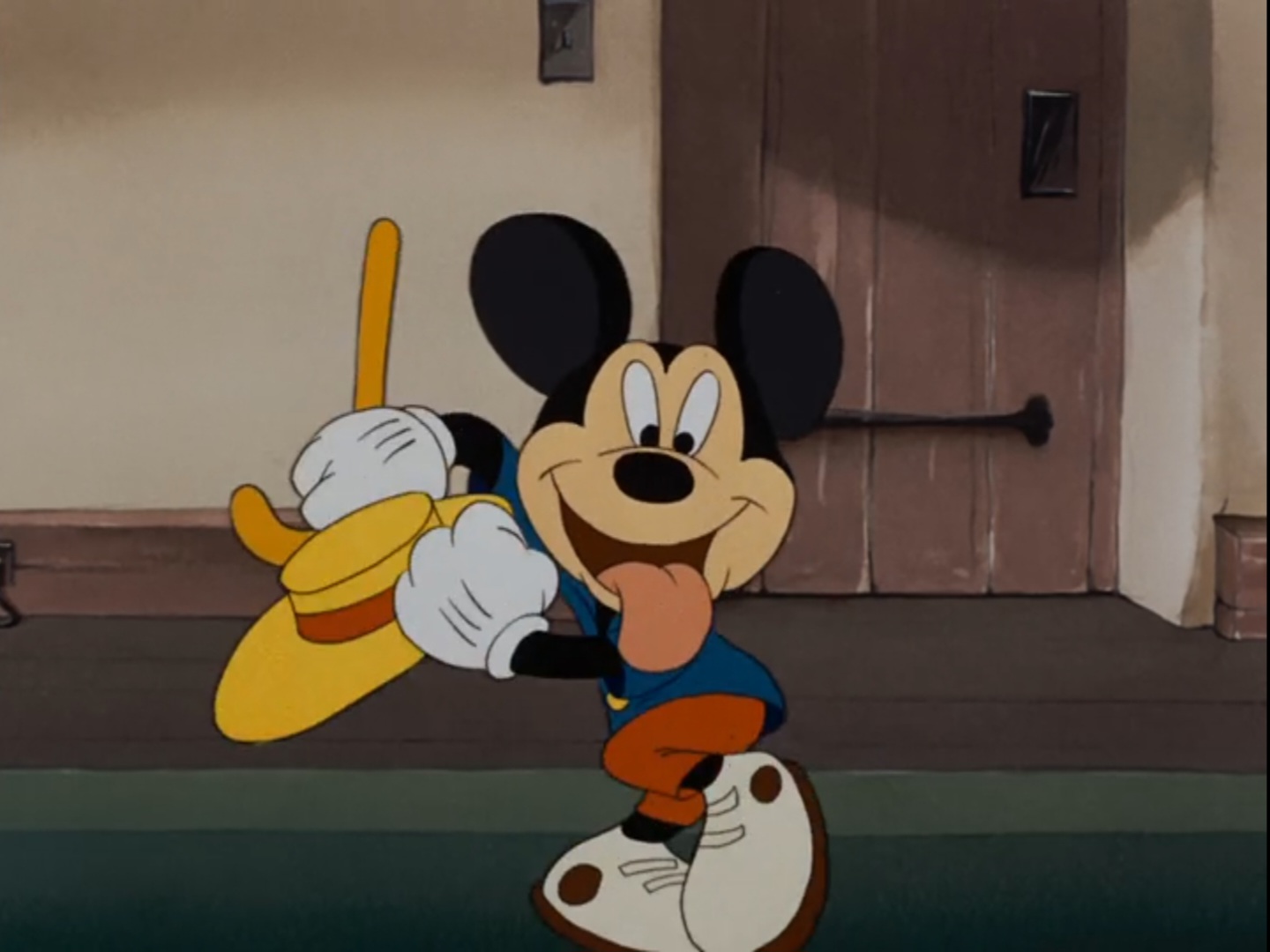
Mickey's design became more modern. The House Of Mouse is my favorite Mickey excluding the classics. I don't know why this is not on Disney+. This show is hilarious.

2006 brought Mickey to CG animation. I remember watching the crap outta Mickey Mouse Clubhouse when I was little. I don't recall liking it nowadays, but it was definitely a step into liking animated shows and animation as a whole.
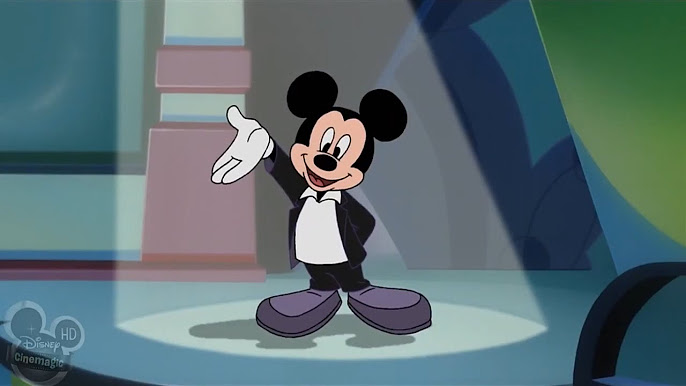
And now we get to the more current designs of Mickey and his friends.

These definitely had passion and it looks expressive, but I don't know how I feel about the actual shorts themselves.

When I watch one of these, they don't make sense to me. I do like how the backgrounds and colors look but it never really peaked my interest. Don't know why.

I am fully drawn to alot of characters and Mickey is definitely the easiest to recognize. Animation changes all the time whenever it's for the good or the bad, the classics should always be remembered for being important though.
No comments:
Post a Comment